( Case study 04 · FamigliApp · AI product )
AI Product Experiment: 421 Leads in Month One
A household app that's actually live: real users, real payments. Solo build — design, product, code and growth — using Claude Code + Figma MCP.
- Client
- FamigliApp — solo build, 2026
- Disciplines
- Product Design · AI-assisted Development · Growth · Design Systems
0K
Google Ads impressions
0
Visitors in the first 30 days
0.0%
Conversion from lead to trial
( 01 · The idea )
How far can AI take a real product?
I wanted to see how far I could get building a real product with AI doing most of the coding. FamigliApp charges money, and the login has to work at 3am when someone's adding milk to the shopping list.
- ✓1,150 commits in 46 days
- ✓9 core product features
- ✓10/10 email deliverability
“Many households are disorganized — no one really knows where the money goes, and the mental load gets spread across the family.”
( 02 · Dashboard )
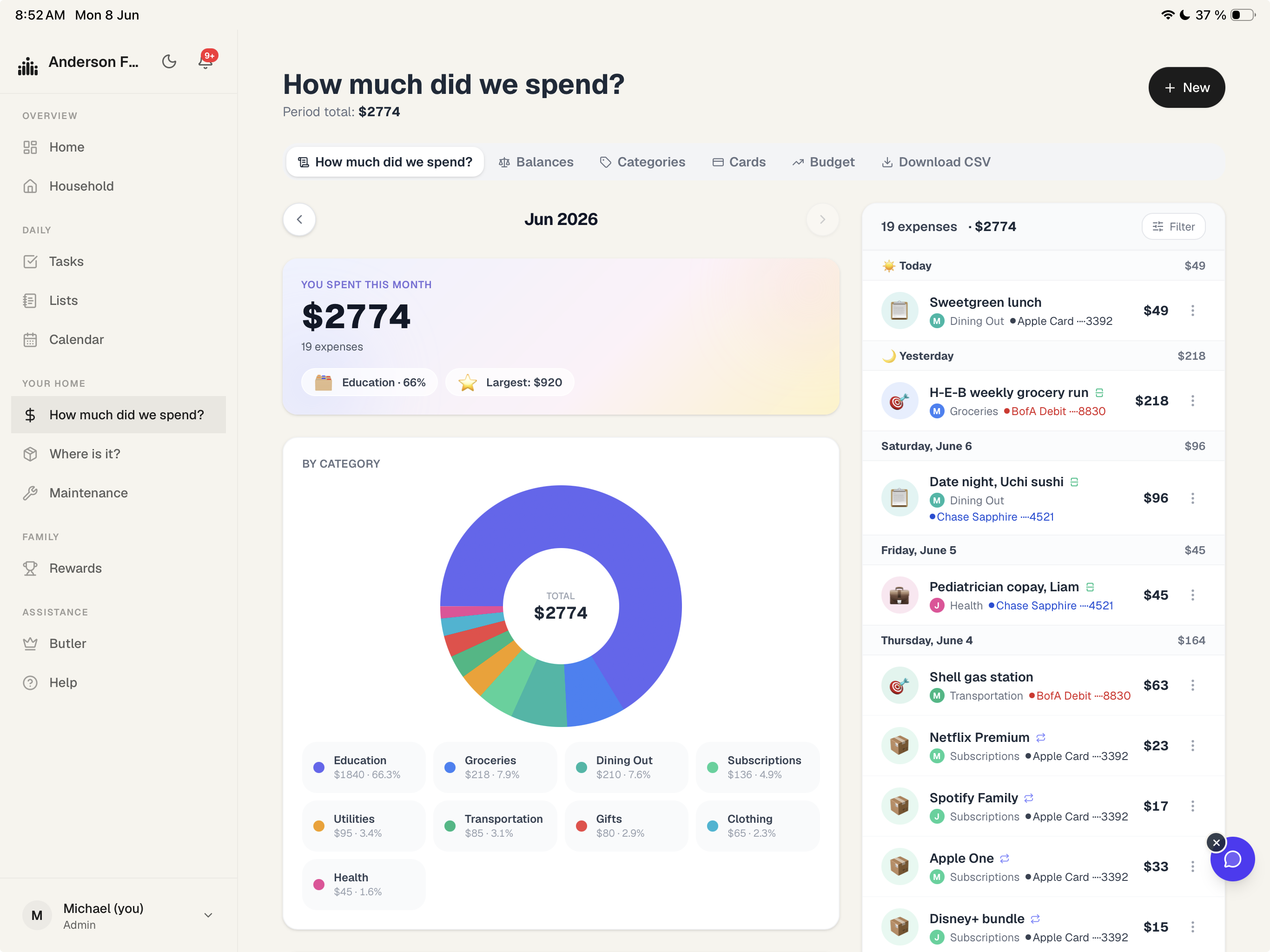
One household, at a glance
The dashboard answers one question: are we OK? Pending tasks, this month's spending, what's coming up and anything running low — side by side.
( 03 · Expenses )
An expense in five seconds
Amount, category, who paid, how it splits. The new-expense sheet is built for one hand while you're standing at the checkout.
If logging an expense takes more effort than the expense is worth, people stop after the first try. Most of the work went into keeping that habit alive past the first week.
( 04 · Design + code )
This is how I speed up my work with AI
Instead of Figma first, I built from day one in VS Code with Claude Code — testing, iterating and sharing with real people right away. I designed an expense sheet one morning, had it live by the afternoon and watched people use it that night.
The butler is one tap away
( Month one · Google Ads )
What 30 days of paid traffic actually did.
A $150 test over 30 days (Apr 30 to May 29), pointed at the Spanish open beta. Small budget, but enough to learn something.
$0
Ad spend (30 days)
$0.00
Cost per click
0.0%
Click-through rate
0
New users (GA4)
0
Sessions (GA4)
0
Leads captured
From V1 to V2
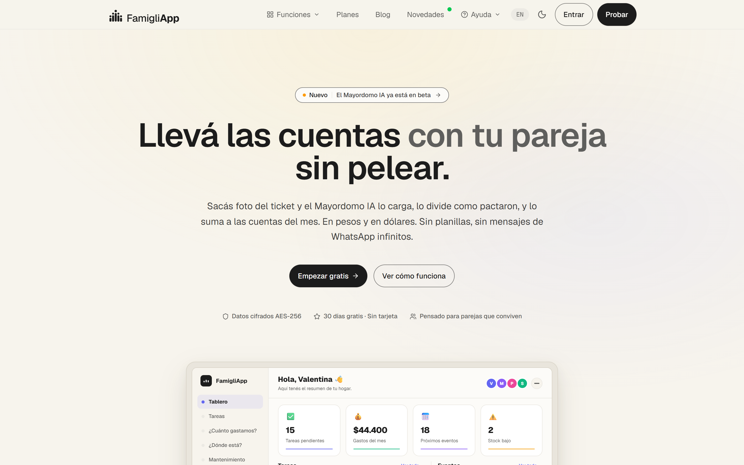
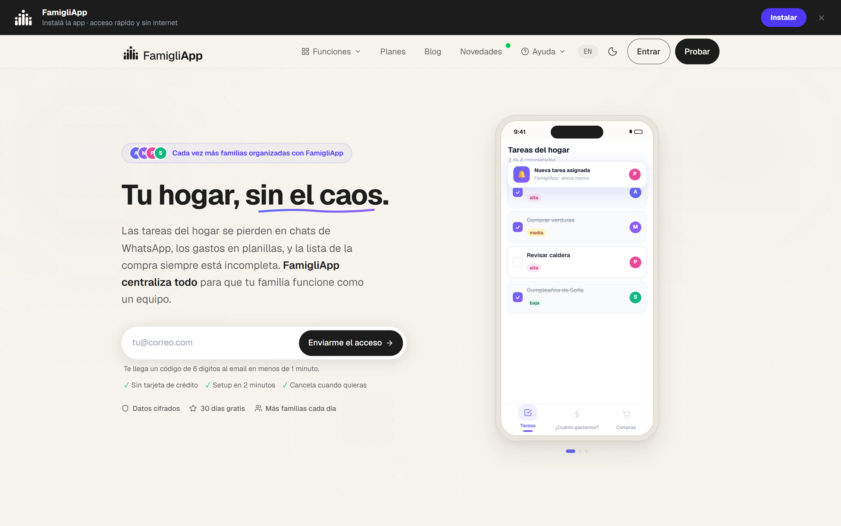
The three calls that shaped the product.
Options considered
One funnel for everyone · Translate everything but keep one gate · Two locales, two purposes.
Why this path
Test the app with real users from Argentina, while sharing an English version with hiring managers.
What I learned
These two audiences want opposite things; one shared funnel would've done a bad job for both.
Options considered
Keep V2 and A/B test copy · One landing per ad campaign · Bento system with reusable cards per persona.
Why this path
With the bento template, every persona page uses the same pieces, so I stopped piling up design debt.
What I learned
Forcing every persona onto the same components is the only reason the design stayed manageable as it grew.
Options considered
Confirmation emails weren't showing up. From May 17 to 19 I rebuilt the email setup from zero.
Why this path
I moved all transactional emails to a new provider and switched from a magic link to a 6-digit code.
What I learned
I'd filed it as a minor bug — it was actually stopping people from signing up at all.
Code was the easy 5%.
Shipping a product is mostly not coding: getting discovered (SEO, a Spanish open beta and an English gated demo) and making people want it.
5% · Code
( Gallery )
Still early — I'd rather end on open questions than a victory lap. Next: measure the couples loop properly, find where people drop off, and compare it head to head with the old version.